02-01-21
Rebuilding mattmclean.net
Online portfolio renovation
This humble home of mine on the internet had its last major renovation in 2015. I’d like to think I’ve learned a few things since then, and the site was practically crying out for a more minimal, lightweight approach.
Generally speaking, I wanted to make the site a little easier to traverse, and bring information closer to the surface. I started by choosing a much lighter color palette. This gave the site a more open and airy feel. It has the added benefit of image borders being clearer against the background (important since I share a lot of imagery in my portfolio and blog posts).
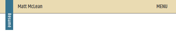
The translucent overlay of the old main menu header counterintuitively made reading more confusing, so I made sure to clearly separate the new one from the page content. The new menu interaction is now consistent on mobile and desktop. I also chose to clearly label the menu instead of hiding it behind a “hamburger” icon.

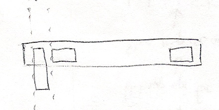
Following the idea that it should be easier to get to the content, I got rid of full-browser-height featured images on every page, and paid closer attention to typography and content sizing. At the same time, my sketches yielded some unconventional elements that I really wanted to try out.
The first of these was the concept of vertically-oriented menu items. Featured prominently on the homepage, they look a little like the spines of books. This motif is echoed on other pages of the site as “bookmarks” that indicate your current position. These blocks are the primary source of color on my site, and, indeed, each section is loosely color coordinated.
The other concept I liked was the interaction paradigm for viewing my portfolio. I wanted to lead with type rather than imagery for the site overall. Since my artwork is very visual, this presented a unique challenge. The concept went from a standard grid layout, to a common sidebar portfolio layout, to one with a rolodex-like presentation. Ultimately, the winning concept was the sliding “control panel” design. It’s not perfect, interaction-wise, but I love how smooth it feels to rotate through the content.

On the top level portfolio page, where each section is introduced, I wanted to pay homage to creativity and interconnected ideas. I chose “section icons” that evoke 2D sketches and 3D wireframes, and animated them using walkway.js. The shapes have no specific meaning; rather, watching the icons get drawn onscreen speaks to the process of creating things, which is almost never straightforward, yet produces a completed artifact.

I also spent some time thinking about how to reorganize my content. Previously, my artwork, photography and projects all went into a single portfolio area of the site. I decided that there was no reason to stuff everything into one place since, in effect, the entire website is meant to be a portfolio. That allowed me to break out distinctive creative pursuits into their own pages where they can benefit from their own showcases.
The photography page is the odd one out. Before the redesign, it was never linked from the site navigation and could only be reached directly. It was meant to be a stand-alone micro-site so that people interested in my photography could focus just on that without wading through anything else. As such, I often give a direct link to this page for photography exhibitions, business cards, etc. While I adapted it into the new site style, its layout continues to be mismatched with the rest of the site. I feel it’s more important that it retain its original function – at least, for the time being.


The page that took me the longest was actually the homepage. I struggled with what, and how much, information to put there. Once I started thinking of it as a landing page, it was easier to focus on the impact it made rather than any particular content. The final touch was to colorize one of my landscape photos and draw contoured lines over it. This really pushed the homepage into that “graphic” character I was looking for, and is a good representation of the intersection of my creative interests.


This project gave me a chance to explore some functionality I wasn’t taking advantage of before:
- Loading certain scripts only when they’re needed, like masonry.js on the photography page, or slick.js on portfolio pages (I was doing this, but not nearly as effectively);
- WordPress menu walkers;
- WordPress Gutenberg editor for content;
- image srcset functionality to dynamically load images depending on the screen size;
- Dark mode;
- Integrating with Marmoset Viewer and ArtStation to allow visitors to interact directly with my 3D models.
While I’m almost certain that, in another five years, I’ll go through this process again, I’m really pleased with how everything came together. I’ll be happy to live in this internet home until then.